How To Make Your Resume Really Stand Out
When it comes to seeking employment opportunities, portraying yourself in the best light possible is often challenging.
Especially when you have to stand out from a crowd of candidates with pretty similar abilities to yourself.
You can never guarantee that questions asked within a job application will allow you to show your full suite of abilities or portray your true character.
So it’s left to the resume, or curriculum vitae, to be the medium that helps you shine.
Today we’re going to talk about, and provide examples of, four quick fixes that will help your resume communicate better and visually stands out from the pack.
The ways in which we can work to make your resume stand out include:
- Using a format that is tidy and is easy to read
- Relating your skills and experience to outcomes
- Remaining on point and relevant to the role being applied for
- Adding a deal breaking splash of creativity
This article looks into how to create a resume that stands out from the crowd. If you want to learn why this reformatting exercise is worthwhile, check out our post on the benefits you can expect by maintaining a good resume.

Use a format that is clean and easy to read
First impressions really count, especially when you’re placing your resume in the same pile as tens or hundreds of other suitable applicants.
One common stumbling block to forming an effective resume is its structure and format.
To be clear we’re not talking here about the specifics of what language is best to use, nor what skills to mention and what to leave out. Nope, this is purely about how your details are laid out and presented to the hiring team.
We’ve seen it time and time again, despite careful consideration and best intentions many otherwise good resumes become a tangled mess of dates, responsibilities and certifications.
There is no right or wrong format for a resume, but a good starting point is to communicate your categories clearly with appropriate headings and subheadings.
As a starting point the following headings are normally featured when building a resume:
- Contact – Your own personal details
- Summary – An summative personal statement of 2 or 3 sentences
- Experience – Your past job experience is more valuable to an employer than your education
- Education – Your two most credible educational qualifications
- Skills – Any certifications for skills that are relevant to the position
It’s tempting to try and fit every one of your skills and qualifications onto the single sheet of A4 paper but if you can be generous with white space between your text then do it.
By working in white space you’ll create the impression of a more welcoming and digestible read. This in turn will translate to a the reader (the hiring manager) taking more of your comments on board.
Be aware too of the potential to present information in an ambiguous way.
When using industry specific acronyms for example, don’t be tempted to save 20 characters by abbreviating long titles unless you are absolutely positive that the person receiving your resume is a specialist who understands what each mean.
There is always a chance that the first person screening applications may not be an expert in your particular field.
Moreover and perhaps surprisingly, which font you choose to write in will also make a difference.
If you wish for your statements to be strongly believed then Baskervville was found to be more effective at establishing trustworthiness when compared to several other commonly used fonts such as Helvetica and Georgia.
Believability was increased further when selected text was bolded.
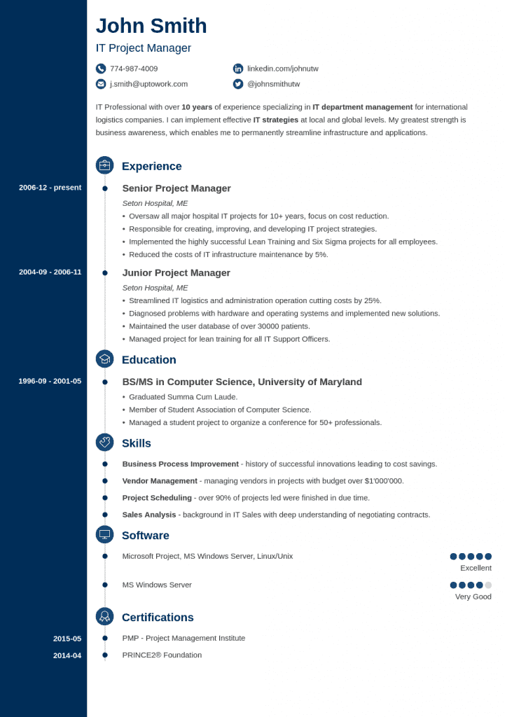
The example resume below from Zety.com demonstrates good formatting through use of white space and shows how using a timeline in combination with bullet points can be effective at organising a large amount of information into a small space.

Relate your skills and experiences to outcomes
The idea behind relating your skills and experience to outcomes in your existing or past employment is that it helps provide the hirer visualise what offering you a contract might mean for their business.
After all it’s not the skill they are hiring for but the tangible benefits that are reached through application of the skill.
On your resume relating skills and experience to outcomes might look something like…
- Instead of just saying you have skill X, perhaps you have helped increase annual profits using skill X?
- Instead of just saying you know skill Y, perhaps mastering skill Y has helped improve customers’ ratings?
- Instead of just saying you know how to use software Z, did you perhaps innovate and streamline how tasks were completed because of your ability to apply software Z?

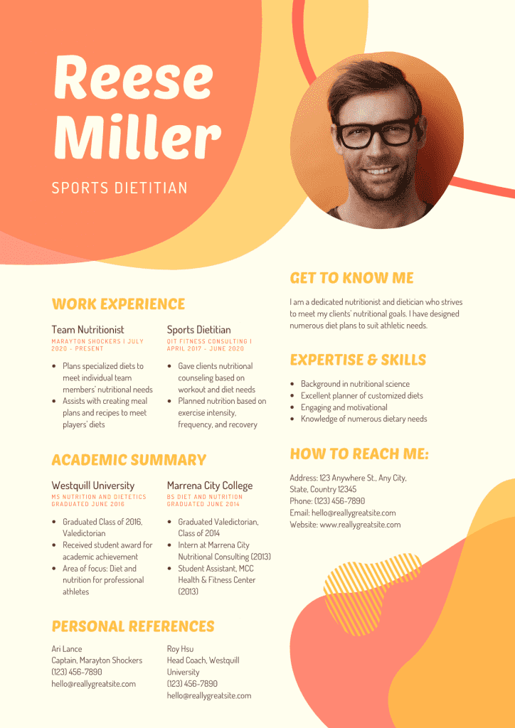
To show a working example of relating skills to outcomes, we can use the above example resume produced by Canva.
In the description of work experience for this sports dietitian resume, past employment as a team nutritionist informs the hirer that the key roles and duties included…
“Plans specialised diets to meet individual team members’ nutritional needs” + “Assists with creating meal plans and recipes to meet players’ diets”
Revising these to reflect outcomes could translate to….
“Retains a high number of repeat clients by planning special diets to meet members’ nutritional needs” + “Helped to establish an excellent TrustPilot rating by assisting to create custom meal plans and recipes for our players”
Tip!
Strong action verbs help your abilities flourish. Here are a few that you could add into the experience section. ReplaceWas with…
- Cultivates/Cultivated
- Sustains/Sustained
- Coaches/Coached
- Inspects/Inspected
- Formats/Formatted
- Partners With/Partnered With
- Designs/Designed
Replace Did with…
- Solved
- Handled
- Fixed
- Connected
- Founded
- Launched

Remain relevant
It’s really tempting to try and mention all of the skills, qualifications and experience that you’ve worked so hard to acquire.
Especially when each has cultivated transferable skills that genuinely would add to your ability to undertake this new role.
Let’s be straight however. You can’t put all of your skills, experience, and education into 1 or 2 pages of A4 paper.
Remaining relevant comes into play when deciding what details remain in your resume and what gets sidelined for this particular revision.
There’s nothing less inspiring to a hirer than being handed something that resembles a basic copy and paste circular.
Sending out the same resume time after time with no regard for the specifics the hiring company is looking for.
It immediately sets the tone that the person behind the resume just doesn’t care enough to take the time to demonstrate that the job description has received and understood.
A big mistake.
For example, if you are planning on applying for a job as a sports nutritionist emphasis would be expected on your understanding of macronutrients or work closely with clients, and not on your ability to take the perfect photograph or organise payroll.
Tip!
Create less noise in your resume better by removing obvious statements such as ‘references are available upon request’.
Any recruiter worth their salt will seek corroboration from references before awarding a position and so there is no need to use up precious space that could otherwise be used to support your cause.

Add a splash of creativity
If we consider your resume as an advert… then the more memorable you can be the greater your chance of making an impression upon the hiring team.
Through clever use of color we can not only create a resume that stands out but also subversively communicate suitability to the advertised role.
For example, the color green is associated with wealth, and is used to promote a sense of relaxation. Having an accent of green behind your headings would be very appropriate then if you were looking to enter a high pressured job in finance.
Black is often used to market luxury products due to its association with power, and so could be leveraged when applying for a position in management.
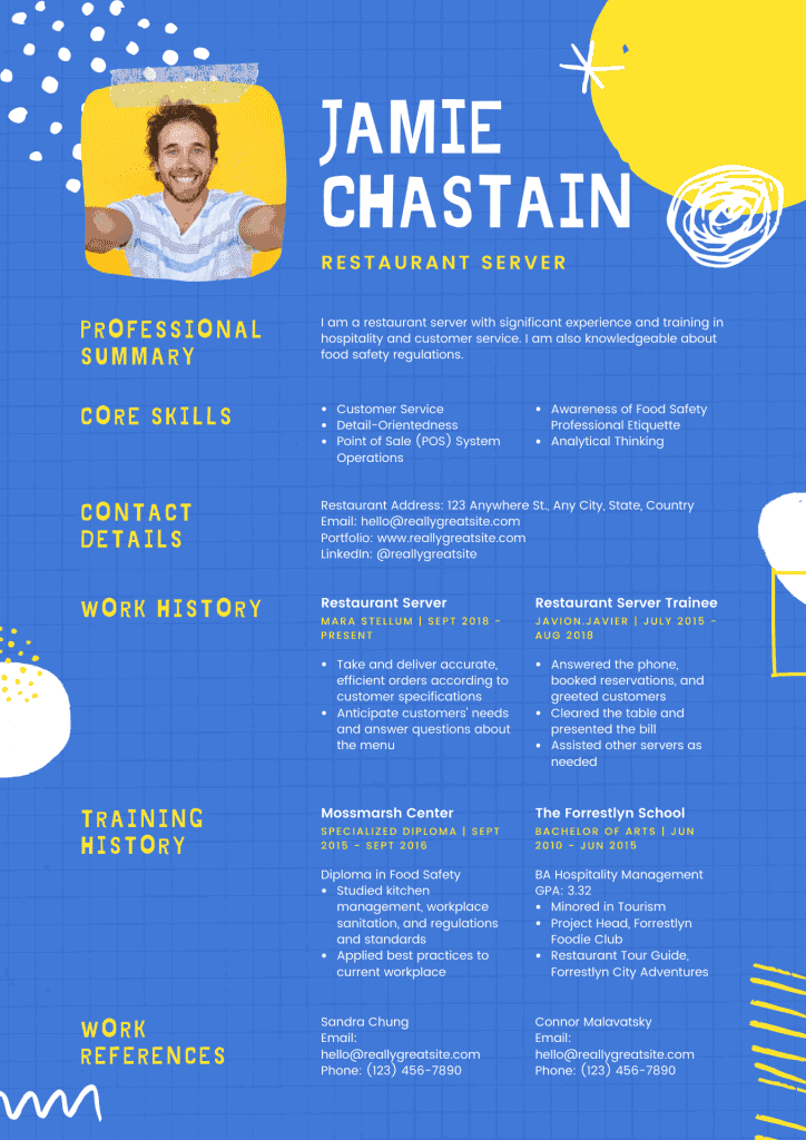
In the example resume above yellow (optimistic and youthful) and blue (trustworthiness) combine and contrast in a playful way to add personality to the written information.
As mentioned previously there is not one winning format for a resume so don’t be afraid to experiment and add a personal touch. A few well placed icons or highlighted headings could well be enough to make the impression that gets you the position you deserve.


